Online marketers know that the real metric that defines a campaign’s success is conversions. Depending on what your goal is, it’s the click on your call to action buttons to ‘subscribe’ or ‘buy’ that matters in the end. While we all know that a call-to-action button should stand out in your message, most marketers struggle to pick the right color for them.
Why?
Take, for instance; you send a consumer an email. This email comprises a few offers, but the key call to action button for you is the ‘subscribe to deals’ button at the end of the email.
Now, suppose all the call-to-action buttons look the same, and the recipient is given the choice of interacting with one- there’s a high chance of them clicking on an offer instead. After all, you did share multiple pieces of content and offers with them. That’s where the importance of clearly demarcating your call-to-action button comes in. It’s like defining the next step you want a recipient to take after reading your email.
So in this article, we’re covering everything about your call-to-action buttons. Right from why they’re important, why you need to apply color psychology to them, which colors present what emotion and action, and how you can create a call-to-action button that actually converts.
Does the call-to-action button color really matter?
Scientific research has found that the colors visible to us directly impact our brain and body. For instance, in one study,
The color red has been shown to increase blood pressure and quicken the heart rate. But different shades of blue have the complete opposite effect on the body. The color calms down the brain and the body.
Another study published in the NY Times suggests that blue is the color that represents creativity. On the other hand, red is associated with attention and is good to maintain focus.
That’s exactly the reason why brands take months and sometimes even years to decide what color should be used in their logo. They want their logo to represent what they believe in, their culture, brand personality and what they want their target market to perceive them as. The Logo Company explains the co-relation of brands and their choice of color for their logos in this video below.
Brands follow the emotional quotient while deciding their brand logo color, which means they want to pick a color that will resonate with their target audience every single time. Each color evokes a certain kind of emotion in humans, making it important for brands to pick their brand palette cautiously.
Check this infographic from The Logo Company decoding color psychology and how brands have leveraged the same.
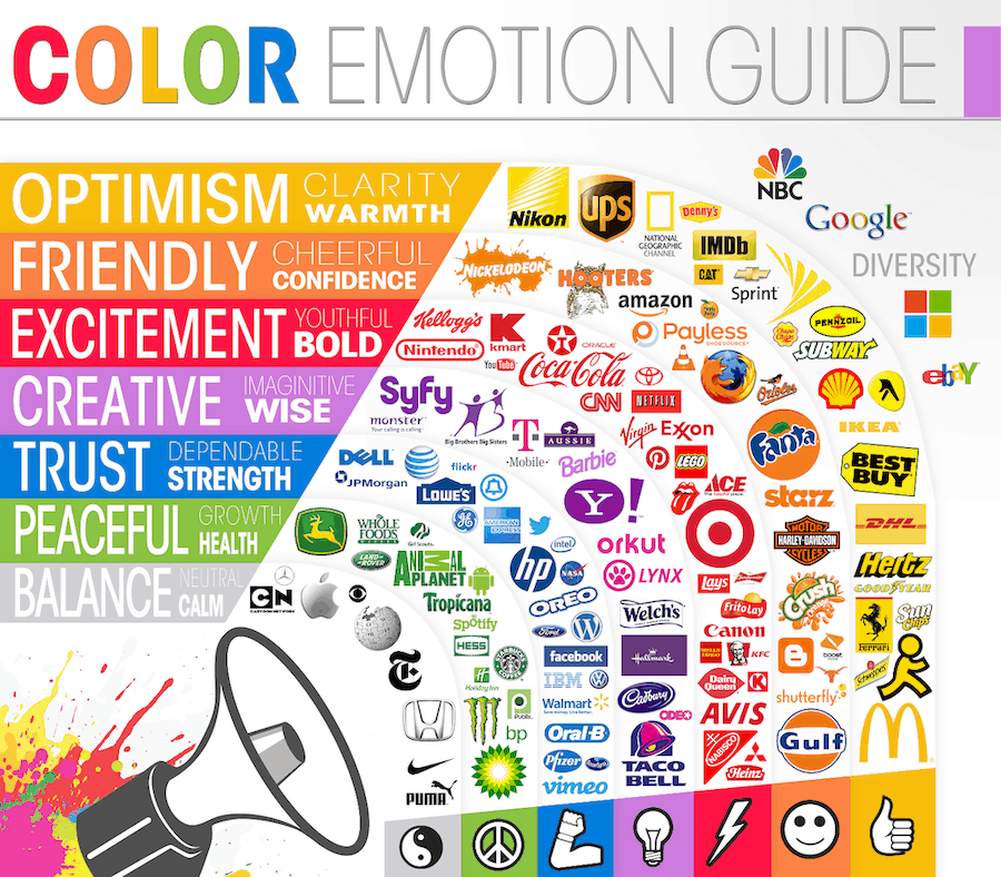
Source: The Logo Company
Still Not an User of Aritic PinPoint Automation?
If you want your consumers to focus on details, you could use red. But if you want them to take action on something, you could opt for the color green, which directly implies ‘do it’ or ‘go.’
Let’s take a couple of examples here.
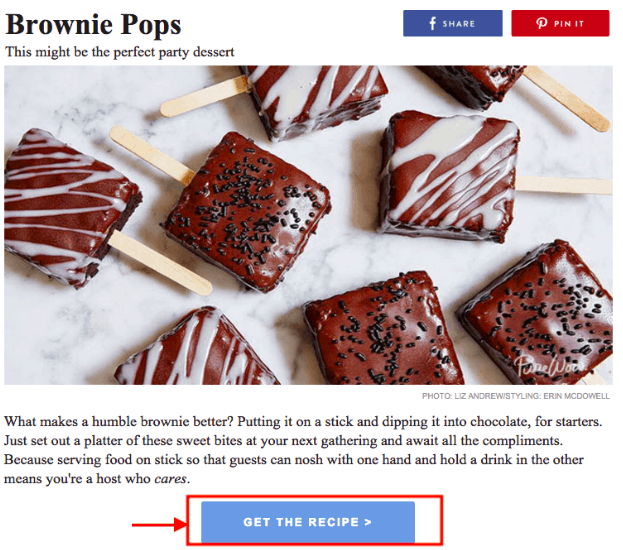
The first is from an email from Brownie Pops. The marketer uses a shade of blue for the call-to-action button. There are two reasons for this – a new recipe is a chef being creative, and it also shows how the overall brand has a creative approach to things. You can also see it reflected in the tone of voice being followed in the copy on the call-to-action button and the email body.
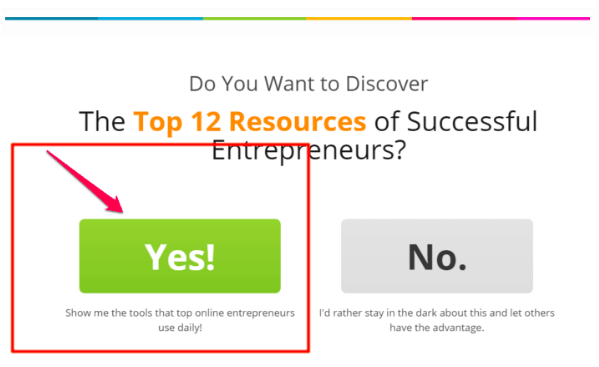
Here’s another example. It is an email popup on Neil Patel’s website, promoting a specific category of resources from the blog. If you notice, the popup uses a pop green color for the call to action button they want visitors to click on specifically. The additionally added red arrow to the design is to get the visitor’s focus towards the button.
Simply put, the email popup uses the color theory behind green and red on its call-to-action buttons to nudge an interaction from the targeted visitor.
So long answer short, yes, the colors directly impact the conversions your call-to-action buttons drive.
Understanding the different colors for call-to-action buttons
Once you start looking, hundreds of colors and thousands of palette options appear for call-to-action buttons. So how do you figure which color stands for what and is suited for which marketing campaign of yours?
Let us help you understand the different colors commonly used by brands for call-to-action buttons and what they depict.
Blue
Apart from creativity, the color blue stands for trustworthiness, sincerity, and intelligence. That’s why you’ll see many software companies using the color for their call-to-action buttons.
Think about it. You’re downloading software for which you need to make an upfront payment. You want to be assured that the software uses the latest technology, is built on logical intelligence, and is trustworthy to associate with for tasks.
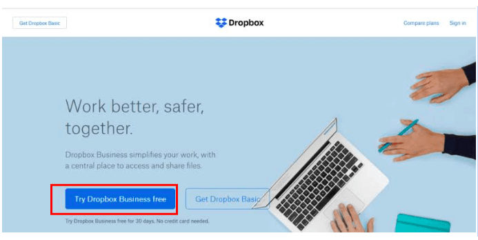
Here’s an example of Dropbox using the color theory. If their target users need to trust them with all their data, they need to make themselves look trustworthy!
Yellow
If you go through the color theory carefully, you will notice that the color yellow and shades close to it denote optimism, creativity, and friendliness. It’s also a great shade to grab attention – be it on a website or in marketing collaterals like the email.
Many businesses use this color for their call-to-action buttons on the website and the email to nudge an action out of their target users.
For example, Moz– Their brand color is pastel blue, so they use pastel yellow for their call-to-action buttons to make them stand out. The buttons are standing out on their site to make them more interactive and actionable.

Red
As we mentioned before, red is one color that immediately stimulates a reaction from the human brain and the body. It is known to quicken the heart rate and promote urgency but stands for being bold – no matter what marketing collateral or industry it is being used in specifically.
Since the color is too bright, it should be used in moderation. You could use it for your emails or on the website call-to-action buttons to pack a powerful punch!
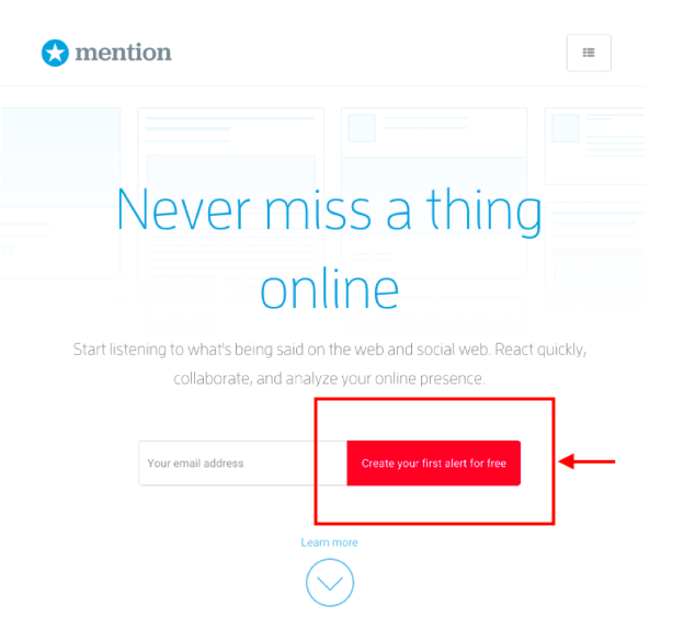
For example, Mention uses it on their website call-to-action buttons. The color is also known to help visitors focus on one action, making it more conversion-driven.
Green
The color green is often associated with wealth and, obviously, the banking and finance sector. But the color also stands for growth and is indicative of ‘do it now. Think of it as the green light in the traffic signal.
You will see many businesses using this color for their call-to-action buttons when they want their target user to take immediate action.
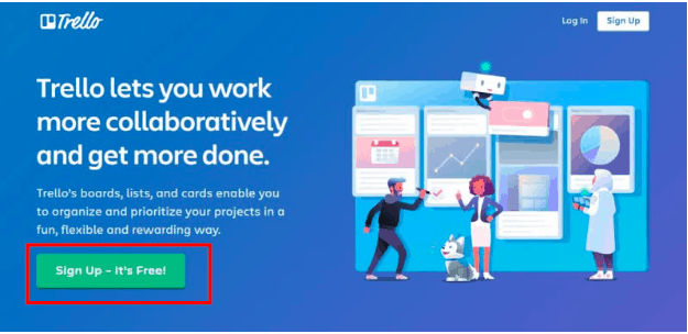
Take, for example, Trello. The software has a free version that its target users can get started with immediately. They want them to know that and nudge them towards creating their first board of tasks immediately. So combining it with a copy that says ‘free’ uses green for their call-to-action button.
Orange
Orange is a color that exudes friendliness and is cheerful for any brand to perk up their online collaterals. It also reflects passion and security as per the color theory and stands out on most color palettes. That’s another reason for marketers to use it for their call-to-action buttons.
You’ll notice this call-to-action button color being used by different brands in different ways. Some use it in solid colors, and some use it as an outline for their call-to-action button. It’s a color that adds a creative touch to marketing collaterals.
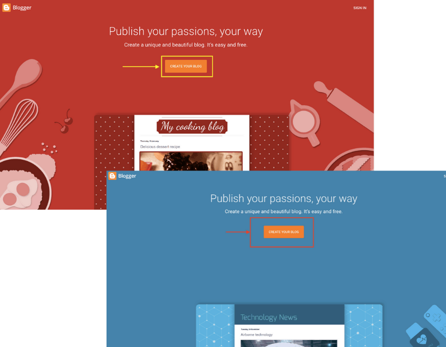
For example, Blogger has a dynamic hero section on the website and uses an orange call-to-action button because it stands out on each palette.
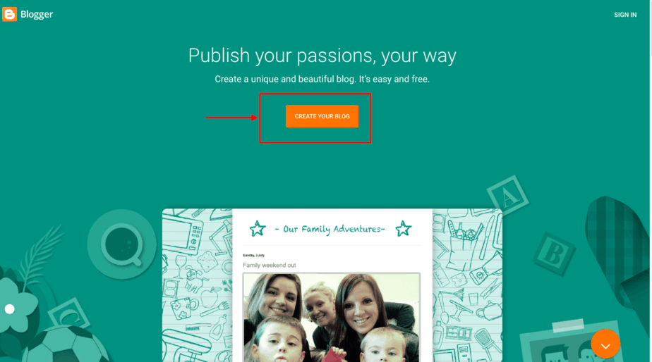
One amazing thing you will notice on the Blogger platform is that the background changes into three colors in total. One is the above, and the other two being red and blue depending on the type of templates. However, their Call-to-action button remains constant.
Pink
Pink is a shade that is often associated with a feminine touch and stands for warmth, love, and nurturing. With many businesses experimenting with color palettes today, you will see different shades of pink being used across different brand elements.
While the takers for pink call-to-action buttons are more women-centric businesses in the industry, you can see others experimenting with the color too simply because it tends to stand out on online collaterals like the website and in emails.
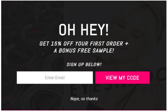
Here’s an example of an email popup using a pink call-to-action button. The button stands out clearly on the black backdrop, bringing the site visitor’s attention to it immediately. Clubbed with a good offer, it makes the visitor want to engage with it.
Purple
The color purple stands for creativity and imagination. It also represents a wise approach to what a brand is doing. But more than what it represents, purple is a shade that stands out on a minimalistic design, demanding attention to be clicked on.
A more modern color, you will see young companies using purple in their general brand palette and for their call-to-action buttons.
Execute Effective Marketing Automation Workflows Now
For instance, Slack, The company’s vision is to make working together seamless with creative solutions implemented right out of their chat app. They’re also a young company in terms of culture, and the purple call-to-action buttons add to the same vibe.

Black
Black call-to-actions are not a common choice but are effective nevertheless. The color black exudes efficiency and power and yet adds to a minimalistic sophistication.
You’ll see industry leaders like Apple using the color to enhance further and present their sophisticated approach to innovation. But at the same time, you will also see software companies using modern technology like artificial intelligence experimenting with the color to depict its ‘power.’
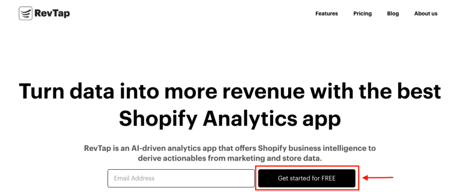
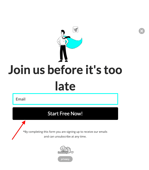
For example, RevTap uses black for its call-to-action buttons. The idea is to reinforce its hero title and convey how powerful its analytics software is.
Even their landing page follows the same theory.
Ghost
You may have noticed that in some of our above examples, there are two call-to-action buttons. While one is clearly using a bold color, the other is mostly an outline or transparent overlay of sorts, commonly called ‘ghost’ buttons.
It exudes minimalism and sleekness, a depiction of the approach a business follows for its processes.
The transparent shade is not commonly used as it tends to blend with the rest of the design. But you will see businesses that have bolder, solid colors being used in the backdrop of their sites, dashboard, or marketing collaterals, using it for the call-to-action buttons.
For instance, we at Aritic PinPoint have our “Contact Us” button as a ghost button. It complements our theme and background color as well as the blue ‘Sign up’ button.

ConversionXL shared an in-depth piece on the usage of the ghost buttons and where they are effective. Read it here.
Tips to create a high-converting call-to-action button
1. Should convey a meaning or message
Remember, a compelling call-to-action button is one that clearly states the next steps for the user. So the copy or message you convey on the button should be simple to understand, but at the same time, compelling to read.
A good practice is to use your hero title to convey your business proposition or key message. The call-to-action button copy should reinforce the action the visitor needs to take on reading the core message. But remember, if the visitor notices the call-to-action first, it should still convey the same meaning in reverse. Or it should be able to engage them so much that they go back to reading the hero title key message after noticing the call-to-action button.
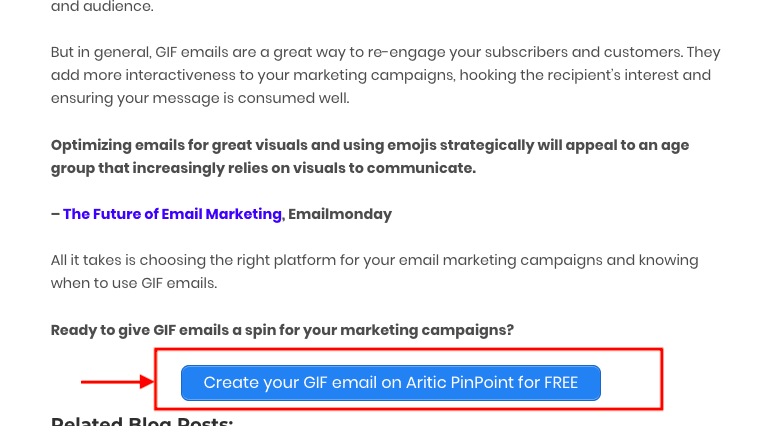
For instance, in our last blog on when to use GIF emails, you will see Call-to-action buttons throughout the post encouraging our readers to get started with GIF emails right from there. Our internal reports show that using such call-to-action buttons with a proper message has improved our lead capture rates 2X over three months.
2. Maintain consistency in Call To Action Button color
You could continually experiment using different colored call-to-action buttons. But at any given point in time, it is essential to maintain consistency.
Simply put, if you decide to use ‘yellow’ as your call-to-action button color, make sure all collaterals follow the same. Be it your website or a promotional email; they should both use the same call-to-action button color. It improves the recall of the next steps a user is supposed to take on seeing the call-to-action button, making them more likely to convert on it.
For instance, we always follow the ‘blue’ color on our blogs, website, landing pages, emails, and mobile messages. This consistency helps create a static image in your users’ minds so that whenever they see that color, they can relate it to your brand.
3. Understand what size fits and where
A call-to-action button is meant to draw attention. But that does not mean it jumps at the reader so much that the rest of your message gets lost or makes them feel you’re pushy with your demands.
The right size of a call-to-action button should be ‘not too big and not too small.’
Strike a balance by optimizing the size of your call-to-action buttons based on where you’re placing them. For instance, if it’s too tall, you can make it a little wider instead. And if it’s too wide, you can make it a little taller – the idea being that the space it is placed in doesn’t look too cramped, and there’s enough padding around it to make the button stand out.
4. Know where to place the Call To Action button
One of the most important aspects of creating a converting call-to-action button is to know where to place it. It needs to grab the visitor or the recipient’s attention immediately, but not too soon as well. For instance, if you want to add a call us now button, then it should be somewhere you want to create a sense of urgency.
Neil Patel conducted an in-depth study of different call-to-action button placements. The article shares that placing the button below the fold can increase clicks by 304% as, by then, they know what they’re signing up for purposely. But at the same time, for some businesses, placing it above the fold brought in conversions.
Simply put, it’s all about how engaged you’ve kept the reader. That will make them want to click on your call-to-action button. But keeping it visible is always a best practice!
Conclusion: Choosing the right color for your call-to-action buttons
The truth is that there is no one-size-fits-all approach here. A color that might work for one business might not bring in as many conversions for yours.
The only way to know which color works for you best is to keep testing different ones across different collaterals continually. All you need to keep in mind is that no matter what color you choose, it should stand out from the rest of the elements to capture the visitor or the recipient’s attention immediately.
It’s also important to combine the right call-to-action button color with the right copy. If your offer is not good or compelling enough, you wouldn’t be able to turn the visitor’s attention into a conversion.
Attract more visitors to your website by increasing the number of customers and contact information with Aritic PinPoint!
⭐ What’s one tip for writing a high converting call to action?
When it comes to writing a high-converting call-to-action, you have many different options. Some CTA’s, such as “Shop Now,” works well for some sites but not others. You need to be aware of your site and what you want your visitor to do when visiting the page. The best way to find out is by A/B testing (testing 2 or more versions of something).
⭐ What are the best call to action buttons?
Call to action buttons are an important aspect of every website. Of course, the text on the button can impact conversions, but there is more to it than just the text. A good call to action button also needs to be visually appealing, easy to understand, and simple for your visitors to find.
⭐ How do you optimize call to action?
The effectiveness of a call to action is reliant on many factors. How you phrase the CTA, where it’s placed on the page, and perhaps most importantly, what you offer in return for said action. All three elements have to speak to each other as one cohesive concept..
⭐ What is a good CTA conversion rate?
Call-to-action (CTA) buttons are a great way to increase conversions on your website. But what is a good conversion rate? Unfortunately, there might not be one! The best CTA button for your website depends on many factors, including the design of the page and the form you’re asking people to fill out.
⭐ Is call to action a persuasive technique?
Yes, A call to action is a persuasive technique that encourages people to take a specific action. CTA may be used as part of a sales pitch and usually appears on marketing material, such as advertisements and web pages.
⭐ What is the best call to action words?
Call to action words are the few words that you would use in your ad copy to inspire people to take action. The most important thing is to find the right call to action words and an appropriate tone for your copy.
⭐ Should CTA be left or right?
Studies show that a lot of people read the landing pages analytics from the left-hand side moving down. Position your CTA on this side and ensure it stays below the fold. You can also try a few placements so that you can gauge the best place. A place where you will get the best conversion.
⭐ Which call to action button works best?
The call to action is the ultimate goal of your content. That’s why it’s important to make sure your CTA is visually appealing and informative, and relevant. In addition, you want to avoid sending visitors offsite when they could be taking advantage of everything your site has to offer.




1 Comment
Hello there, I appreciate you for sharing valuable information. It is all about color psychology- one color may appeal, and one may not appeal to prospects.