Let us consider a marketer who has an excellent product to market. The traffic rate to his site is overwhelming, and the landing page is breathtaking. But for some reason, the conversion rate keeps falling below his expectations. What can he do? Should he rewrite the entire content? Or should he tweak another landing page? Is it about their design? This is a real struggle for some marketers.
They never understand why the landing page is not performing as it ought to. Fortunately, there are a few common mistakes about landing pages that one can avoid. These mistakes may be the ones affecting your performance and numbing the rate of conversion. Check out some of the landing page mistakes and their solutions below.
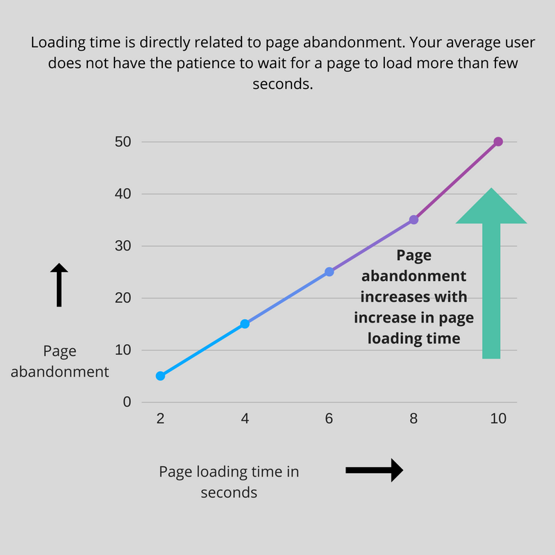
1. Your landing page is taking longer to load
Pages that have a delayed loading rate can easily irritate a person. You can create a striking impression if it takes just a few seconds to load. When the loading rate is slower, you tend to lose half of the visitors to your site. For instance, several years back, Google had a 20% drop in traffic due to a mere 0.5 seconds delay in search results loading time. Ouuch!
If your site has more landing page background images and graphics, the load time may decrease. Test the load time of your site or email landing page as often as possible to know if there is a problem or not. Even a second’s delay can reportedly cause a 7% reduction in conversion traffic.
Pro Tips Alert:
Always know your current speed with Google’s PageSpeed Insights. It is a reliable tool that serves you to identify your speed ranks. It scores your site on a scale of 1-100%. If your site rates poorly, PageSpeed will tell you how to maximize speed for mobile and desktop performance.
Use minimum redirects: URL forwarding is a strategy that uses more than one URL for a webpage. But when you have too many URLs, the speed of the page will further lower. Identify the redirects that slow your page down and eliminate them. This will help you to enhance the rate of the page. There are fantastic tools that you can use such as Xenu’s Link Sleuth and Screaming Frog SEO Spider.
Have a hold on your images: Larger files such as large images can cause tons of problems that are unnecessary. Before you upload a picture, resize it to ensure it conforms to the perfect size. If you are hosting larger files like videos, do it externally. Doing this will help with your performance. You can use Wistia or similar tools to Wistia.
2. You are using boring headlines
Headings can take your content to a whole new level. Some statistics show only two people out of ten read a copy of the material after reading the headline. The first impression you make on the readers is your headline. Seldom it is the only impression.
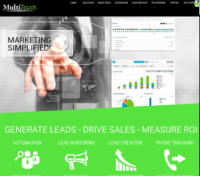
For instance, check this landing page excerpt from MultiTouch. The landing page opens with ‘Marketing Simplified’ which is way too common to trigger any interest. Even if you put that aside and look at the whole landing page, you first find yourself cringing at the suited hazy man doing a Minority Report for you. Just again, you read the brand name and its MULTITOUCH. Yet the man in the suit is doing single-touch? Eh?
Alas. The Minority Report replica looks cheesy with no information that is important or intriguing. There is nothing in this landing page content that will give way to highlighting whats so different about MultiTouch!
Therefore, write headlines that will result in higher conversion rates.
Use the following formula:
Still Not an User of Aritic PinPoint Automation?
- Have specific headlines
- Include vital information that interests the prospects
- Ensure it captures the prospect’s expectations
To make an insightful headline, use words that prospects commonly use to define their pain points. For instance, they may say, “It is very annoying when my computer is slow.” When you use these words, you will attract the prospect to read the content. Even so, the trick is to know the words that they use. You can learn by listening to their conversations on forums or blog posts. Learn all you can and incorporate these words into your headline.
The Classification of Ads
When you read the book, “Made to Stick,” you will discover that 89% of ads can fall into five categories. From WordStream, these categories are:
Testimonials: Here, we use the testimonial of a customer who was satisfied. Use it as a headline. It will lead to higher and better conversion rate as we see on the site. When a reader reads something positive from another user, the information will have an enormous impact on their decisions.
Use of cliffhangers: Cliffhangers are the best way to ensure that many people read the copy. All marketers who know how to write exquisite cliffhangers always tend to sell more. Fill your prospects with some curiosity rather than trying to push them to make a purchase.
Value proposition: Here, we spot the primary pain point of the customers and write a headline with the value proposition.
Using the list format: As funny as this may sound, it actually works. Many people prefer reading in list formats. The reason is that our brains prefer this format. Content Marketing Institute claims that listicles with odd numbers do better than those with even numbers. This means that it is not enough to have a listicle headline. It has to be one with an odd number.
“How to” kinds of headlines: These are headlines that do better after listicles. You can use this headline to achieve better engagement and results.
To be confident with your headline, ensure that you test it. Create a variation of the headline and compare them against each other. Pick the headline that performs the best to get higher conversions.
3. Your Call to Action is not effective
Call-to-action is what will ultimately move your readers to take the step that you want them to. Without a perfect call to action, your landing page is useless. Therefore, ensure that your call-to-action is unique and un-ignorable.
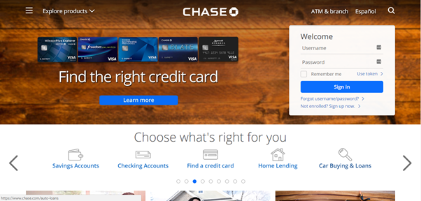
For instance, check this landing page from Chase. It is a popular bank name, yet their landing page bouce rate will make you go “Oh! Why?”
Here’s how the landing page starts. There are a series of credit card snapshots with a blue CTA below the tagline. Then there is also a form at the right-hand side for current customers. Both these CTAs side-by-side are of same color and style, thereby nullifying the effectiveness of each other in a snap.
It just gets worse. This credit card landing page below is as overwhelming as it can get. Technically, this landing page is about helping you understand whether you are qualified for a credit card or not. However, Chase throws so many credit card options at one-go, it becomes a lot to take. Add to this, none of the CTAs make any sense.
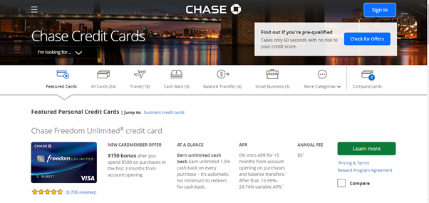
Issues:
- Usability
- Multiple offers overlapping with each other
- Too many CTAs
The Fix
Use strong verbs: When you use such verbs, they will move your readers to take the action that you suggest. For instances, a call-to-action like, “Sign Up for a Free trial today” will yield better responses.
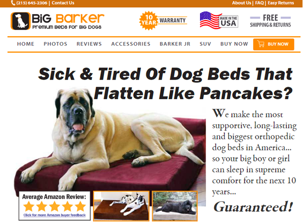
Include a social proof: When the call-to-action has a massive crowd back up, it will powerfully impact the readers. A perfect example is Content Marketing Institute’s call-to-action. It says, “Join over 1,80,000 of your peers!” this call-to-action has an excellent social proof and will move the reader. But don’t overdo like Big Barker Bed who had included around 40 reviews in its landing page, stretching the landing page to 38 pages. Yep! 38!!
Let the user know how they will benefit: Ensure that the benefits your product offers are crystal clear. Let the reader see how the product will improve their life.
Position your CTA strategically: Studies show that a lot of people read the landing pages analytics from the left-hand side moving down. Position your CTA on this side and ensure it stays below the fold. You can also try a few placements so that you can gauge the best place. A place where you will get the best conversion.
Properly align the verbiage of your headline copy and your CTA. Reinforce what you promise to deliver in the CTA.
4. Your landing page has font issues
The kind of font that you choose to use will significantly impact the rate of conversion for your site. There is research evidence that shows us this. There is an excellent association between one’s psychology and fonts. When the font is unique, you will always enjoy higher conversion rates.
Are you wondering about the font to use? You can use larger fonts from 16pts. When the fonts are more prominent, they make reading the content very easy; Some sites use fonts as large as 21pts. You can also choose Serif fonts which rank better than others. Serif fonts have small strokes that are attached to each letter’s ends. Studies show that with such implementations, you can have better results.
Pro tip: Fonts should be aligned in such a way that it does not look clustered or spaced out. Special mention to Big Barker’s landing page again that got stretched by 38 pages because of the large fonts they used.
In all these, remember that as much as you want your body copy to stand out, the headline must be impactful too. There is nothing incorrect about using a different font-type for the headline and yet another font for the body. All you have to do is keep the number of different fonts that you use on the minimum side. This will help mitigate font fatigue.
PS: Text placement is also important in your landing page. For instance, this bulleted section in Big barker’s landing page comes after you’ve scrolled down, while this should have been at the top.

5. You are not giving offers that are hard to ignore
Look at this landing page from Frontier. I’ll give you a challenge. Try to find out how to view your bill on this landing page.
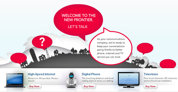
Did you get it? No? I thought so.
Frontier is supposed to be a communication company, but it fails to communicate at all on this landing page. It is more like a mystery hunt while navigating through the landing page. Hmmm!
The bubbles do no good either. When you move your mouse, a question mark will appear. Only when you click, you get to the bottom of that bubble. Add to this, three ‘buy now’ buttons. Ummm like why? What did Frontier think of their target audience?
Execute Effective Marketing Automation Workflows Now
This landing page is a serious fail because you don’t know what it offers, you don’t understand what to do next, and aarrgh, there’s too much mystery to unravel in one landing page.
Off to something good now.
There was an analysis of $3 billion in advertising spending by WordStream. They were attempting to understand what makes those sites that perform wonderfully different from those with an average performance. They realized that small changes in the color of buttons impacted the conversion. The most significant discovery was that there are more powerful factors behind this.
Landing pages that have super success rates use exquisite offers. Break away from the regular proposals that even your competitors offer. Be creative. For instance, WordStream started offering free AdWords grader rather than providing free software trials.
If your landing page analytics is not giving you the results that you desire, then it is time to re-create your offer. Examine ways to make it better. Create a proposal that will address the most burning pain of the customer. Once you have a new offer, test it to see if it yields the results that you expected.
What you need to remember
Everything revolves around your customer. In the same way, the landing page of the website has the sole purpose of moving your prospects into the sales funnel. It is also responsible for driving the customer to decide to purchase the product or service.
Therefore, I advise that you take the time to analyze the landing page. Invest a lot of time to evaluate your current landing page. Define the weak spots that the page has and come up with a plan that fixes this problem. Once you do this, you will be moving closer to the goal that you have. You will reach out to more customers, and in turn drive more revenue.
Let us know about the mistakes that you have made on your landing pages.


9 Comments
These are some great tips. Thanks for sharing such a wonderful article.
These mistakes are always made by marketers, hence thanks a lot to the Aritic team as avoiding these mistakes can convert the landing page in seconds.
Thanks a lot, Pritha, it was interesting to read about the mistakes which must be avoided. As a new marketer in the market, I found it useful for a successful marketing campaign.
Great work Pritha. Well written content. The updated mistakes in the article are too common, which can be helpful for any marketer to avoid these.
The mistakes mentioned in the article are very common; hence this article will be a great help for any marketer.
A well-written article you have written here. Any marketer should follow these strategies. Thank you!
Great insights, especially the fifth point which says about the offers, which are a great way to entice new prospects to the landing page.
Good information to avoid mistakes in landing pages as landing pages are one of the first connection points with potential customers.
When it comes to your MSP landing page, everyone needs to know: Are you making the right choices? And what should your target audience be?