Hello there, 2023 will continue to be the year of emails, it is predicted that almost 319 billion emails per day will go out this year! Understanding the anatomy of email template-designed created practices can be tough for professional businesses, companies, and industries. So how would you up your game to deploy smart and learn new email template web design practices for your email marketing?
It all starts with asking: what is an email template?
The aesthetics of an email template offer and includes Images, fonts, color like black, palettes, copy – all of these elements to make up for a good email. If your content is well thought of, it will boost your email open rate.
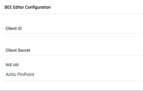
Did I tell you Aritic PinPoint lets you access to configure the BEE editor for your landing page and email template design? Yep, with their all-time pro favorite drag and drop editor, you can also configure and customize the BEE Editor and next get ready to learn to access and enhance your new marketing campaigns automation and save time. It’s awesome since all templates and elements like photos in the tool and devices are mobile responsive.
Here are 13 mistakes that you need to avoid and get a look at in your email template to ready to grab your user’s eyeballs and grow your industry [ You’re email template inspiration included].
1. Settling for a Non-Responsive Email Editor Template
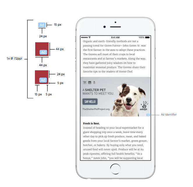
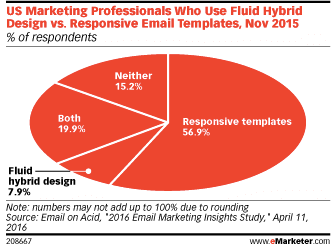
It is important to keep a look at the layout as a single column and make it no wider than 500 to 600 px. This type would make and help your emails readable on mobiles, devices and better on web. Esp, If you include and add buttons for CTAs for click rates or even links, make sure they are in the resolution of 44X44 px. This is the guideline that even Apple gives.eMarketer reports that 56.9% respondents opted for responsive and customize new welcome email template design.
2. Pre-header and Header Size is more than 150 px
This will not drop or deviate your audience’s focus for the main message or the call to action buttons below. This also drives maximum engagement for your emails.
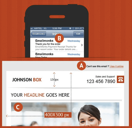
Image Source: SmartInsights
3. Using All Caps or Spammy Words
Reflecting your professional brand identity in your email designs is providers important. The first easy tip is you need to get to remove All Caps in your subject lines which will include Keeping it short and crisp like a pro.
Spammy words such as ‘4U’, ‘Address on CD’, etc. are a huge and big turn-off and do not intend to add. Readers are not to be fooled in this age and time. The moment uses these over-emphasized and spammy words and message, readers will know. So, avoiding such collection of words will only enhance you’re new professional creative quality. To know what are the most common spam words, check or drop-in, in this list from Comm100
4. Not focusing on the color palette for your email template
Almost 90% of the reasons why consumers buy and find a product and services providers is because of the colored adverts. So Market them accordingly. For email templates, colors get to play a significant role in understanding the reasons that lead to a higher email open rate.
For example, black or Red is a color that defines the popular online type of platforms/industries like Youtube or Netflix. It is known to be eye-catching, pro and can be used to highlight important elements in the marketing email. The photos, color palette you need to start to choose elements should define you’re created brand identity, and people should be able to recall your brand from the emails and messages you sent.
Still Not an User of Aritic PinPoint Automation?
One of the amazing, beautiful, and best type of email template tool examples to understand and find out how colors are created and play a vital role in email templates is to note the Holiday marketing email from brands like Apple.

5. Choosing the right font
Start Choosing the right font is as important as picking the correct, beautiful, and best color palette from the wide range for your marketing email campaign. According to a recent Bloomberg article, designers think certain fonts always work for an email editor while some are an absolute no-no.
For instance, Helvetica is the font that Apple Mail uses while Gmail sticks to Arial. It also reveals that nerds love Helvetica because of the neutrality in the creative. Font designers, on the other hand, call ‘Arial’ font to be ambiguous.
This article is an eye-opener because none of these two fonts work. Rather, the font designer suggest Georgia and Verdana as the best fonts to use in an email.
6. Embedding Videos in Emails
The best tip is you need to create an easy image online and start redirecting it to your landing page once done. This way you can also track and find out how many people clicked on the link and how many people landed on your page.
Say hello to Videos!! Embedding videos in emails campaign is surely a cool trend, but there are certain problems with the user experience. According to Wistia, when users start reading an email with an embedded video on mobile phones, they are forced to go to a different webpage or website to get to view the video.
Getting people available to watch our videos and read our content online and message shared is great, but I want many things that can’t be accomplished from my user’s viewer’s email client. I need full interactions, not just views. That’s how we market.
When your video is on your own creative landing page, you have more control over your viewers’ next action like automation and builder.
7. Using too many images in one email
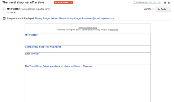
So here are the updates, if you’re confused as to why not to use images in your emails, there is a simple metric that says most of the consumers tend to disable images on their mobiles. It comes to mind that it was fully revealed in an analysis by Gmail:
43% users read emails on their mobile devices without turning the images on Share on XFor instance, take a look at this example from Net-a-porter:
8. Spoiling your audience for choices
We have an attention span lower than that of a goldfish! It’s a pro! What you should avoid is fully stuffing your emails every time with multiple links, offers, creative new images, and confusing your audience which isn’t required. This will also lower your conversion rate. See below a highly confusing email to get you to learn and understand better which will help in management:
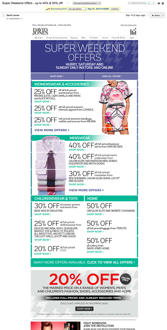
Keeping your email to-the-point in real time is essential. When you are designing the email template builder, it is important to zero-down on which particular feature you would want to focus on and what purpose you are building and are you looking for like drag and drop, which industry it belongs to, available to serve, and also includes offer with that particular email.
Here is a simple and easy email template with just one CTA:
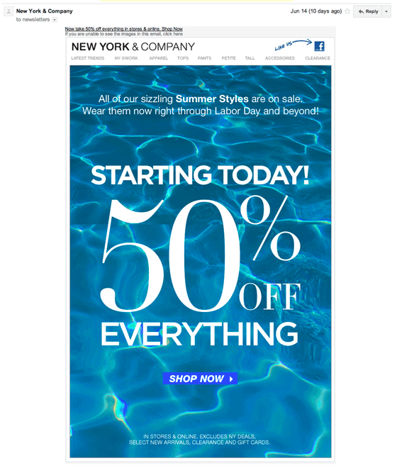
It is minimalistic in approach, has one single focus point, and is clean.
9. Not providing a browser version of your email template
You know that link down below. Yes, it is important for people who might face loading or rendering problems in the email. Help them to get to see a browser version so that they are not driven away. To build a user experience for your email readers, just test it out first every available time to see if you can identify all the elements.
10. Not allowing users to Unsubscribe
This is important, and you should treat this as an email marketing platform mandate. If you do not give them this option to unsubscribe, they might end up marking your email as SPAM. You would not need this to affect your emails deliverability reputation. Make sure your email template and layout help them easily locate this option!
Other Errors that Impact Email Design
Some errors are not directly related to the email designing, but the designer should take caution and be ready with the updates. These are such errors that come and can hamper the eCommerce Template quality and cause audience engagement to take a backseat and drag so start to set your categories right.
11. Not optimizing the ‘To’ and ‘From’ fields
Yes, it may look trivial, but these areas need should be optimized to personalize your emails.. Include your brand name in the “From Name” field, use a valid address in the “From Address” field and the “To” field should have your recipient’s name with contact details. These small tips can help you go a long way to start engaging with your audience in no time. For more tips to land your emails in the inbox, check out this article: 14 Tips to land emails in the inbox.
12. Telling a long story through your email design
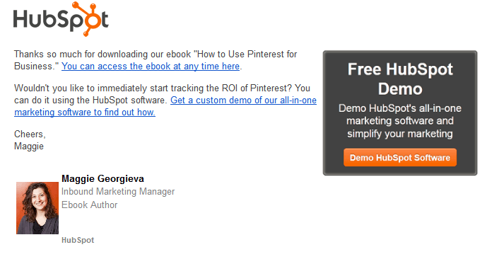
Remember and ensure you are using email marketing to engage with your audience. Use short and crisp text to embed your message. Try to get into that short attention span your readers will have. You can hyperlink texts, and they can always help to come back to get you to read more. For instance like this short email from HubSpot:
The design is clean. The spacing is perfect. The purpose was solved.
13. Sending out emails without testing them with major email clients
Last but not least sending and Test out across all the major email clients like Gmail, Yahoo, Outlook & AOL. Try, make and select an ESP whose eCommerce templates work awesome across all email clients.
Every email template has features like drag and drop less white space, good colors, and fonts, the perfect amount of texts and messages, and is short.
If you think there is more to this article, you are most welcome to join our community let us know in the comments below. We will help you to keep updating the post with all your inputs and need. Also, Subscribe to get our newsletter for more such blog/content.
⭐ Why shouldn’t you embed a video in an email?
Embedding a video within an email is not only unnecessary, but it can also actually hurt your campaign’s chances of success. A simple video link can do the same job as an embedded video to enhance engagement and increase click-through rates.
⭐ Why should we test emails?
In order to get the most bang for your buck, you need to test, analyze and optimize every part of your email marketing campaign. Email testing is like everything else in marketing: It’s all about trial and error.
⭐ How can I improve my email template?
Improve your email template by making it more functional and effective. Emails are an essential part of marketing, but they can be challenging to create. In order to successfully market via email, you need a well-designed template that is both simple and easy to use.
⭐ What makes a good email template?
A good email template is clear and easy to read. It’s also super responsive, looks great on every device your subscribers use, and includes a call to action at the end, which prompts them to do something with your content.
Execute Effective Marketing Automation Workflows Now
⭐ How do I make my email more visually appealing?
There are several ways to make your email campaign stand out. Including images, videos, or gifs in your email is a great way to get your audience’s attention. But, you need to make sure that you are sending the right message with the visual content.
⭐ What design decisions make a business email look professional?
Design is the main element that makes or breaks a business email. No matter how good your content or offer, if your design is unprofessional, it can give off a bad impression to the recipient and may even drive them away from checking out what you have to say. Take the time to make sure you are designing an email that represents your company in the best possible way.
⭐ What is a hybrid email?
A hybrid email is a series of marketing emails that are designed to build a list, drive traffic and convert sales. A hybrid campaign consists of multiple touchpoints with your brand’s audience, including content upgrades, blog posts, opt-ins, and more. It can be used in conjunction with an autoresponder or as a stand-alone campaign for maximum results.
⭐ What is responsive HTML email template?
A responsive HTML email template is an email template designed to display optimally on all devices.


13 Comments
An eye opener. Thank you
While talking of emails, open rate and subject lines are not the only things to focus upon but email template design is of equal importance as well. Aritic PinPoint has made it much easier to understand the whole concept, smart solutions have been offered.
In truth, it will be off putting for anyone who sees a clumsy email template. It is fundamental to keep the design in minimalistic and clean approach. These frequent design mistakes ought to be avoided. On the whole this is a very descriptive article.
Hey! You have provided a comprehensive and helpful list of email template design mistakes to avoid. Great work. Keep sharing such good works.
Usually we use email templates because they allow us to conclude the effectiveness of the messages swiftly and helps to adjust our strategy to the on-going requirements. Now I know what kind of email templates I must avoid. Thanks for sharing!
Recently started practicing email marketing. I must admit that this article covered points beyond my knowledge. Quite a few things I followed were inadequate. Henceforth will practice according to the steps provided. Thanks a ton.
These errors are so relatable. I have myself made some of these so frequently. Thanks for the compilation. Really helpful because these errors do affect the email performances and engagement metrics. Cheers.
Agreed. Thanks a lot for sharing the article as it helps marketers to avoid the mistakes while designing email templates.
Thanks a lot, Jnana, for updating this comprehensive list of various email template designs which must be avoided. It is an eye-opener for beginners.
Aritic PinPoint has made it much easier to understand the whole concept, smart solutions have been offered. Great post!
Email templates have been a useful asset to design the complete campaign, all thanks to Aritic PinPoint platform which has made the whole concept easier.
Thanks a lot, Jnana I always wanted to gain some information regarding the email template design mistakes.
Blimey! A perfect article. I believe the length of an email template is one of the most important factors to consider. It should be just enough for your message to be conveyed, and it should not exceed one page. If your email is too long, it will look like spam to the reader.