Designing emails for a smooth lead experience requires a focus on simplicity, visual appeal, mobile optimization, personalization, clear call-to-action, and testing and optimization. By keeping your email design clear, concise, and visually appealing, optimizing for mobile, personalizing your content, and including a clear call-to-action, you can create a better experience for your leads and increase your chances of converting them. Regularly testing and optimizing your email campaigns can help you improve their effectiveness over time.
Jump Directly to
1 . Always have a recognizable sender name
2. Draft short and engaging subject lines with a relevant pre-header
3. Pick fonts based on the purpose of the email
4. Create a header that instantly connects with the audience
6. Maintain a visual hierarchy in the email design
7. Strike the right balance when it comes to text and visuals
8. Add suitable Alt-text to the images
10. Provide valuable information that the lead would be looking for
Still Not an User of Aritic PinPoint Automation?
11. Include contact details in the email footer
12. Never forget to include a fallback for your email
13. Incorporate the “View in Browser” link
14. Provide an unsubscribe link in every email
Of course, drafting personalized communication according to behavioral history is important, but it is equally important to focus on sending a well-designed email.
Here are 15 simple and actionable tips that will help you with email design, which will render a flawless lead experience and enhance engagement.
(1) Always have a recognizable sender name
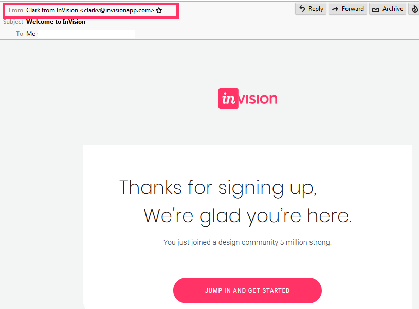
Your sender name determines the credibility of your emails. Make sure it is familiar and trustworthy so that the lead does not have to think twice before opening your emails. Avoid sending emails from a “no-reply” email address as it makes the lead feel like you do not want to hear from them.
Here’s a nice example of how your sender name should be.
(2) Draft short and engaging subject lines with a relevant preheader
Next comes subject lines. Your subject line should be crisp and clearly convey the purpose of the emails.
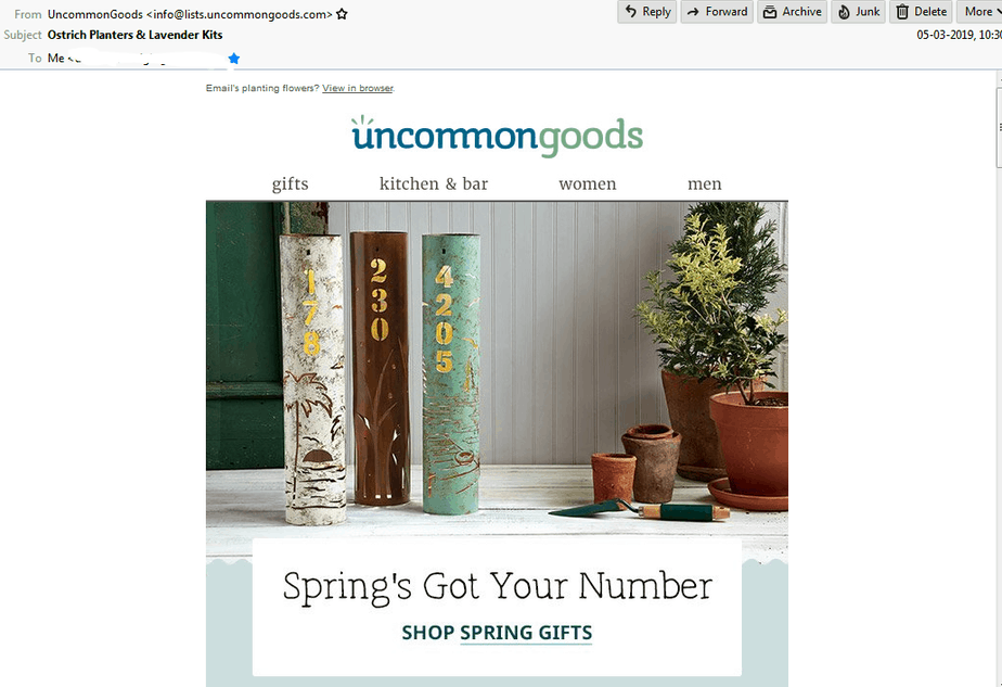
If you have something more to say but the character limit of subject lines poses a hurdle, you can elaborate the subject line with a relevant preheader. Share on XUncommonGoods sends out a pretty Spring email with a straightforward subject line and a relevant preheader text. Also, note how the subject line and copy are perfectly in sync with each other.
(3) Pick fonts based on the purpose of the email
According to the emotion you wish to trigger in the lead’s mind, pick the right fonts for the email. While Serif fonts work the best to highlight actionable insights in an email, Sans serif fonts are used in emails that include short content sections.
On the other hand, you can use calligraphy fonts to make emails fun to read and monospace fonts to give a minimalistic look to the email. Your email design relies a lot on the kind of font you are using.
(4) Create a header that instantly connects with the audience
Email design is not just about colors, images, and fonts. It goes beyond that.
The header is like the headline of a newspaper article. To draw the reader’s attention and entice them to read the article, you ought to have an attractive headline. Define your branding within the header so that the recipient can instantly recognize the sender. You can use the same header for different email campaigns to ensure consistency and get a better engagement rate.
Your header image should invariably include the company’s name and logo. It should also shed light on the type of email—whether it is a transactional email or a newsletter.
Take a look at the example by National Geographic below. They have vividly included all the different branding elements in the header image along with the offer.

(5) Choose the right colors
Choosing the right color scheme while designing an email entails the selection of a base color or brand color and then the secondary or tertiary color according to the base color.
As an example: Yellow is related to sunlight and evokes happy vibes while red is the color of passion which is believed to automatically increase the heartbeat. Ever noticed how the logo of McDonald’s and Burger King includes yellow and red colors together? That’s the influence the color scheme has.
Here’s a color guide by Piktochart that throws light on how to select the right color combination in your emails.
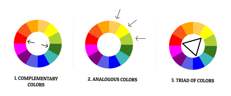
Complementary colors: Two colors at the opposite positions on the wheel look good with each other.
Analogous colors: Colors adjacent to each other go well together.
Triad of colors: A combination of three colors that are at equal distance from each other can be used together in an image.
(6) Maintain a visual hierarchy in the email design
Design your email in such a way that the leads can easily scan through it. The most important information should be displayed at the top of the email with a catchy headline. The information should flow in the form of an inverted triangle; the most important information should be at the top and narrowed down towards CTA.
Take help with the squint test. Just sit back from the screen of your laptop or computer and squint your eyes. See what catches your attention on the first go. If that’s the kind of experience you want your lead to have, your email is good to go. If not, you might have to redo the design.
Travelocity aptly follows the principles of visual hierarchy. Take a look.

(7) Strike the right balance when it comes to text and visuals
Of course, visual marketing has made its mark in the world of digital marketing and email is not an exception. However, when it comes to emails, it is important to strike the right balance between the text and visuals.
Maintain the text to image ratio at 80: 20 to steer clear of the spam filters. Never send an email with just an image or any attachments, otherwise, it might get marked as spam.
Execute Effective Marketing Automation Workflows Now
(8) Add suitable Alt-text to the images
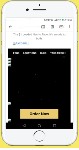
Whenever you add images to an email, you must consider the email clients that have images blocked by default. To cater to such leads, you ought to have a suitable alt-text with the images.
It will not ruin the lead experience even when the images are turned off, and at the same time enlighten the reader on what the images could be about.
Without alt-text, your email would make no sense and look something like this:
(9) Design minimalistic emails
Rather than making the emails too cluttered and distracting for the lead, design minimalistic emails with ample white space. It will enhance readability and convey the message more clearly.
Not only does it impart a better lead experience but also enhances the conversions by emphasizing the most important part of the email.
Look at the example by Duolingo. They have made brilliant use of illustrative images with plenty of negative space.

(10) Provide valuable information that the lead would be looking for
The key to the perfect lead experience is providing valuable information that the leads are looking for. Try to troubleshoot the challenges that they could be having. Consider their previous interaction with the brand and personalize the emails with relevant details.
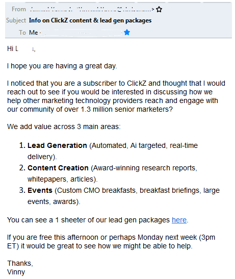
For example, Clickz sends a compelling lead nurturing email to the lead with information about their top services, lead gen packages, and contact details.
(11) Include contact details in the email footer
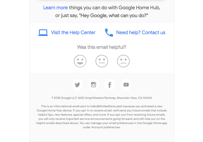
The email footer is your last chance to build a connection with the reader. Add information like contact details that you have not mentioned in the email copy. You should also add links to the social media channels (Facebook, Twitter, Instagram, YouTube, Pinterest, your website Blog, etc.) to let the lead interact with your brand on alternative platforms other than email.
Mention the mailing address along with the phone number and email address at the end of the email. Needless to say, do not forget the fine print of privacy policy and disclaimer.
Here’s an example of a well-designed footer by Google.
(12) Never forget to include a fallback for your email
Interactivity is gaining immense momentum in the world of email designs. Unfortunately, not every email client supports these interactive elements. Therefore, you should always have a fallback for your emails.
For example: As gamification emails do not work in Thunderbird, the leads will be able to view the fallback version of the email. Doing it right will ensure a smooth lead experience without tampering with the message.
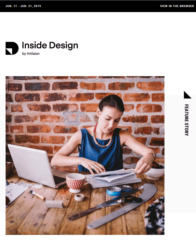
(13) Incorporate the “View in Browser” link
The “View in Browser” link complements the alt-text and fallback version as it allows the reader to view the live email in the browser.
Whether it is images, GIFs, video in an email, or any other interactivity or gamification, the email will work perfectly in the browser, thereby rendering the right lead experience.
Here’s an example to inspire you.
(14) Provide an unsubscribe link in every email
Many a time, emails do not have an unsubscribe link which comes off as a turn-off for the recipients who wish to opt-out. Give your leads the liberty to unsubscribe with a clear unsubscribe link at the footer of the email.
You can also have a link to the preference center so that the lead can change the email preferences.
Given below is a screenshot to explain you better.

(15) Always test the emails
Test the emails before hitting the send button. Make sure that it renders well across all the devices and email clients. Resolve any bugs before the deployment, as broken emails can frustrate the recipients and lead to spam complaints or unsubscribes.
Wrapping Up
Email design is constantly taking new strides and by following these tips, you will be able to manifest a seamless user experience while maintaining the visual appeal of your emails.
We would love to hear from you if you have any other ideas to do so.
⭐Do you have automation available with templates?
You can design professional templates from scratch with the help of marketing automation tools.
⭐ Can I insert an image or an attachment?
In the beginning, you have to select to compose in Gmail app to add the image. If you want to add content above the image, start writing the message first, then put your cursor where you want to upload the image.



1 Comment
Just like designing a website is not like designing a poster (which both use design elements), designing an email is not like designing an advertisement. Emails need to follow certain rules of engagement.